
Lightroom is fun and powerful software and we photographers love to play around with it and try different things. It’s a great tool for adjusting contrast, exposure and white balance and a lot more. You can take an average-looking image out of the camera and turn it into a stunner with a few moves of some sliders. But when you’re first starting out with Lightroom, it can be easy to get carried away and overdo adjustments. This is a tell-tale sign of beginner mistakes that we’ve all made; I know I sure have.
Here are the most common mistakes budding photographers make and how to fix them. Even if you’re more familiar with Lightroom, you may find something here to help you with your post processing.
1) White Balance is Off
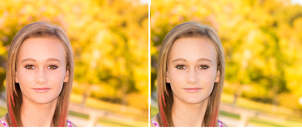
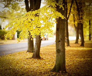
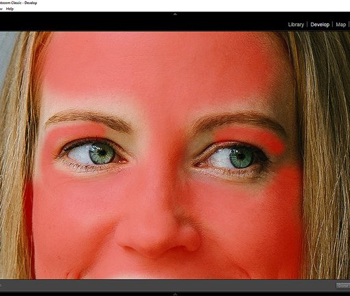
White balance is the color temperature of your image. Many times I see images that are overly warm — on the yellow-orange side, especially skin tones. This can start in-camera if you have your white balance on the wrong setting for your lighting situation.
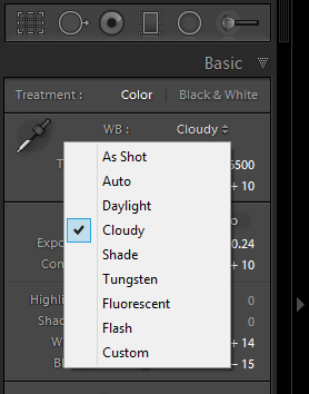
If you’re shooting in Raw, Lightroom gives you a drop-down list of white balance options similar to the options you have on your camera (see image on right). If you shot JPEGs you are limited to “Auto,” “As Shot” and “Custom,” which allows you to set the white balance by making manual adjustments to the tint and temperature. You can also use the white balance selector, which looks like an eyedropper.
You can also run into white balance issues if your monitor isn’t calibrated. Computer monitors tend to have cooler blue tones and it’s easy to over correct based on what you see on your screen. So what looks great on your monitor comes out orangey when you print or looks off when others view it on the web. The best fix is to calibrate your monitor every few weeks (I like X-Rite ColorMunki) and also make some test prints using the same print service.
Bear in mind that “correct” white balance is in the eye of the beholder and there are times when you deliberately want a warmer effect, or a cooler one. In fact, a warmer photo is generally more pleasing to the eye than a cooler one, just don’t give someone a fake looking orange tan.
2) Poor Exposure Adjustments
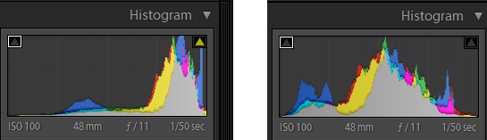
Unless you are shooting in full manual mode, you’ll often find your images are underexposed. This holds true even when you’re shooting in Aperture Priority; sometimes the exposure isn’t quite right. The two key sliders for making exposure adjustments are the Exposure and Contrast sliders. When you are adjusting the Exposure slider, keep an eye on the Histogram. It shows you how the photo was exposed, meaning it shows you the areas of dark, light and in between. The shape of the Histogram isn’t that critical, so don’t be concerned if every image doesn’t have a bell curve. But if the peaks are most prominent on the left side then your image is likely under exposed and if the peaks are mostly on the right then the image is probably overexposed. Watch the Histogram change as you move the Exposure slider left or right.
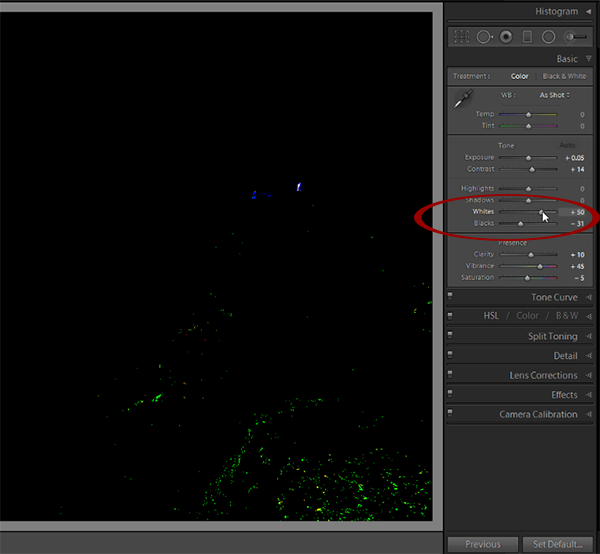
3) No Black or White Point
This bring us to the next point. It’s usually not enough to simply adjust the exposure. In fact, adjusting the exposure sometimes results in the blacks getting too light or dark or there’s no point of maximum brightness. To adjust the blacks, hold down the Alt or Cmd key and drag the Black slider to the left until you start to see just a little color appear and then stop. The spots of color you see are areas of solid black. To set the white point, hold down the Alt or Cmd key and drag the white slider to the right until you see some specks of color and then pull back a little just until the color disappears. Now you have pixels of minimum and maximum brightness.
4) Over Softening the Skin
That plastic “Housewives of Beverly Hills” look can stay on television, you don’t want it in your images. Yeah, I love how using negative clarity can erase wrinkles and make a person look 20 years younger, but you want them to look like real people. Real people may have laugh lines and crinkles by their eyes. It’s perfectly ok to soften them, but don’t remove them completely or they will look like mannequins. So back down on that Clarity slider. I recommend using an Adjustment Brush with a setting of about -20 Clarity and -20 Sharpness as a starting point and don’t go past those points into further negative territory. You can also adjust the flow of the brush to 50 or 60% so you have even more control as you brush over an area.
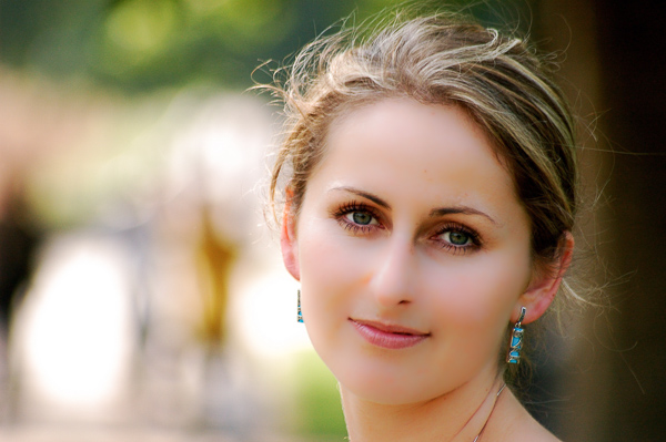
And while I’m at it, let me remind you to never add clarity to a portrait of a woman or child, the effect can be too harsh and accentuate lines and wrinkles. If you want to know more about enhancing portraits, I’ve got a 2.5+hour course on portrait photography with detailed, step-by-step tutorials on editing portraits in Lightroom.
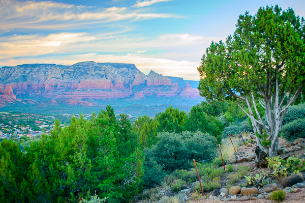
5) Over Saturating Colors
Yes, it’s fun to make colors pop, but I often see images that are so over-saturated they enter the realm of fantasy. Saturation boosts all the colors in the image, including skin tones, so the result can often be over the top. To get a more subtle color boost, instead of using the Saturation slider, use Vibrance. The Vibrance slider affects the midtones only, so it’s not so garish. You can also compare your before and after views to see if you went too far or create a snapshot to compare a previous stage in your editing.
6) Excessive Vignetting
Adding a vignette to your image can be a nice effect. What it does is darken the edges of the image and directs the eye to your subject or scene. But it’s easy to overdo it and make it look heavy and over-processed. I like to keep my Vignette at around -10 or -11 most of the time, but it will depend on the image. Some photographers use a heavy vignette as part of their “look” so it is somewhat objective.
7) Over sharpening
Sharpening is something that many people have trouble with because they don’t really understand what it is. Sharpening is a kind of contrast adjustment and if it’s done right, it brings out details and enhances the image. But if you over-sharpen you will end up with halos, noise or artifacts. Ideally you want to sharpen textured or detailed areas and leave uniform areas such as skies with little or no sharpening. You can use masking to mask out areas you don’t want sharpened or else use the Adjustment Brush to selectively sharpen areas. The best practice is to resize your image to the final print size before you sharpen. Unfortunately it cannot bring out of focus images or areas into focus, so you need to get the focus right in camera.
I hope these common editing mistakes will help you improve your Lightroom skills. In general, light editing is better than too much and your images won’t have that heavy-handed, over-processed look. Remember, the beauty about Lightroom is that all editing is non-destructive and you can always go back and re-edit old photos or revert back a few steps in history.
If you want to speed up your editing and workflow, you might want to check out this new set of 101 presets from Digital Photography School. It included high quality preset collections for portraits, landscapes, black and white, grunge and more. It’s a good way to enhance your images and cut your processing time.
What have you learned by your post-processing mistakes? Let me know in the comments!
